3 Ways to Build a Tile Stack Graphic
With any front end challenge, there’s often more than one way to build something. Although equally as often there’s a clear right way to go about it.
But the other day I was building something that I haven’t had to do in a long time. We’re redoing our company site at the moment and needed a snazzy graphic. I wasn’t really sure if there was a right way to do it, or just several "fine" ones.
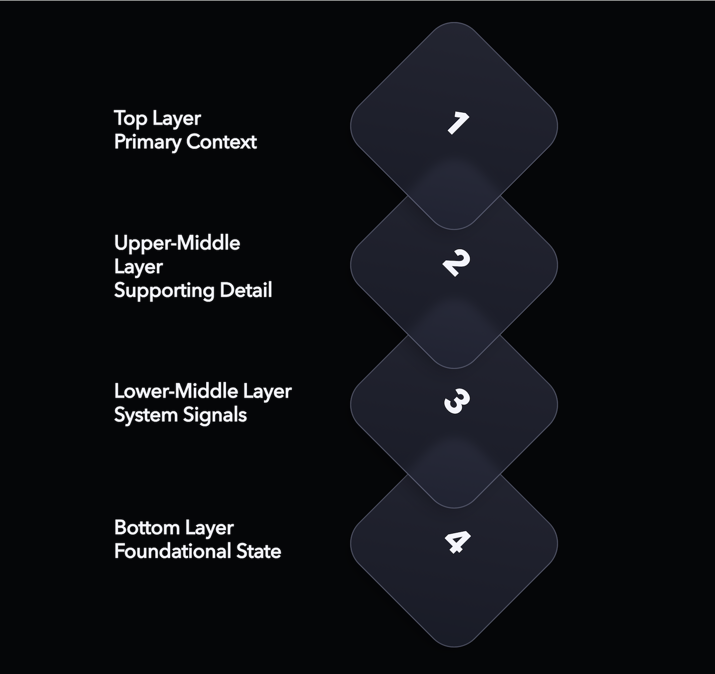
It’s a graphic demonstrating the multiple layers of the company process. Each layer has a descriptive label and a visual tile stacked on top of each other. The tiles should animate up and down similar to breathing.
It’s not purely decorative, but it’s not core content either. It lives in that awkward middle ground. Could it be responsive? Accessible? Searchable? All of the above?
There’s plenty of ways we could represent this information on a page. But which is best? I tried out 3 different approaches and evaluated them based on various factors such as ease of implementation, accessibility and performance. But which won out?
HTML/CSS with SVG tiles
In this example, the labels are positions with regular HTML and CSS. The tiles are SVG images - inlined in this case - with a subtle breathing animation with CSS @keyframes declaration. Layers are stacked on top of each other with a combination of grid placement, absolute positioning and z-index definitions.
The .stack-demo class acts as a container for the responsive aspect. At smaller sizes, users would see less space between the layers and eventually no labels at all - turning this into a purely visual graphic.
This feels like the most appropriate default approach. It’s built from the same primitives as the rest of the site, and it behaves like normal content.
With appropriate elements and aria-hidden="true" where needed, we can prevent assistive technology from redundantly announcing decorative content. We can also easily disable the breathing animation for those who prefer reduced motion.
There’s also no JavaScript dependency here, which reduces the bloat on the site. Everything can be achieved with HTML and CSS, but we are limited to more simplified animations such as this. For anything more complicated we could add something like GSAP to control the tiles without much more overhead.
SVG image
See the underlying SVG on CodePen.
This one takes a the concept of a visual one step further. Could we do this all in an SVG?
Well, the answer is yes you can. This example is an SVG file rendered on screen as the source of an <img> element.
The SVG itself is structured pretty similar to the HTML example. We have a group in charge of placing the labels, with a separate group in charge of the stack. A set of <animateTransform> elements control the spacing to replicate the breathing animation.
This works great as a single, portable SVG asset. It could be easily saved, taken, and dropped into a presentation somewhere. It’s also cacheable in case this graphic became particularly heavy.
It’s responsive, too. SVGs can take media queries much like HTML. We can target screen size and only show the labels when above a certain width. But depending on your screen or browser of choice you might not see that happening at all as this part of the spec is a bit hazy. Typically the viewport is the measured rendered size of the <img> which may or may not be desirable. Firefox also takes devicePixelRatio into account, meaning that labels appear at half the size I intended it to on my laptop screen. Fun!
An inline SVG would work much the same as one placed as an <img> but would be more easily read by assistive technology. You wouldn’t need to rely so much on alt text and browser translation tools would have an easier time adapting the content.
The main drawback of this <img> SVG approach is that it’s inflexible. Screen readers, translation tools and site crawlers can’t easily see what’s inside, which makes it less useful for a wider variety of use-cases. We also couldn’t introduce any interactivity with it being rendered as an <img> which limits its effectiveness.
Canvas
For one final example, I thought I’d see what it’s like to render this entire graphic as a <canvas>.
Stack content is defined as a JavaScript object, including the label, position and tile order. This allows us to create a function that can render a layer without needing to duplicate the logic. We just need to remember to draw it in reverse order so that the first layer ends up on top.
Drawing on a canvas is not as straightforward as the other examples. We need to calculate exactly where we need to draw each line within the 2D context. We also need to factor in the time on an animation frame callback in order to work out where in the cycle the breathing animation is.
Technically the canvas will be responsive by default, as we’re just drawing a rasterised image into the page. We need to manually listen for size changes and adjust our drawing function ourselves to make sure we include the label if the canvas is wide enough.
While using a canvas gives us full reign here to do whatever fantastic visuals we’d like, it comes at a cost being entirely reliant on JavaScript. Any JavaScript failure means the entire graphic disappears. There’s no graceful degradation here. It’s also difficult to style, inaccessible by default and can potentially tank performance on lower-end devices if we’re not careful.
Conclusion
In this case, the boring answer wins. HTML and CSS give us flexibility, resilience, and accessibility by default. Any more complicated animations would be best served by bringing a library like GSAP or Framer into the mix to bring it to life.
The other options aren't wrong, just in this case the content is more valuable as part of the page. We just need to be considerate of how other people might choose to view that content and make sure we don’t get in their way as much as we can.